And When It Truly Works.
A wordmark logo is often perceived as the simplest form of branding. No symbols, no icons, no decorative elements. Just the name of the company, written in a carefully selected typeface. At first glance, it may seem like the easiest path. In reality, it is one of the most demanding.
When executed well, a wordmark feels timeless, confident, and refined. When handled carelessly, it quickly becomes generic or visually unbalanced. The difference lies in precision.
What a Wordmark Logo Actually Is
A wordmark is a logo built entirely from typography. The brand name itself becomes the visual identity. There is no separate symbol carrying meaning. The letters are the mark.
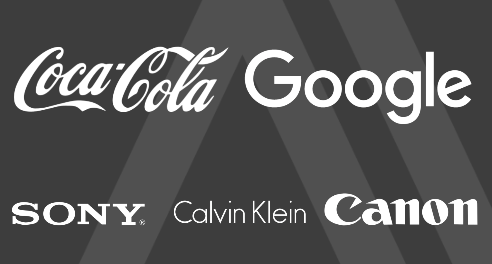
Well-known global brands use this format because it creates clarity and direct recognition. The name is not supported by imagery. It stands on its own.
But this simplicity is deceptive. With no icon to rely on, every detail in the letterforms matters.
Why Some Brands Benefit from a Wordmark
A wordmark works particularly well when:
- The brand name is distinctive and memorable
- The name is short or visually balanced
- The business wants clarity and directness
- The positioning is confident and mature
- The brand operates in a professional or premium space
In these cases, removing additional symbols reduces noise. The brand speaks through its name alone.
For boutique studios, consultants, fashion brands, law firms, architecture practices, and premium service providers, a wordmark can feel precise and authoritative.
It signals that the brand does not need decoration to be recognized.
When a Wordmark May Not Be the Right Choice
A wordmark is not ideal when:
- The brand name is long or complex
- The name is difficult to pronounce or spell
- The business needs a strong visual shorthand
- The audience relies heavily on quick visual cues
- The brand operates in highly competitive retail environments
In such contexts, a symbol can support recognition and flexibility. A purely typographic mark may struggle in small-scale applications or crowded environments.
Choosing a wordmark should be a strategic decision, not an aesthetic preference.
The Nuances That Make or Break a Wordmark
Because a wordmark relies entirely on typography, small mistakes become visible immediately.
1. Typography Selection Is Not About Taste
Choosing a typeface for a wordmark is not about personal preference. It is about structure, proportion, rhythm, and alignment with brand character.
A refined serif communicates differently from a geometric sans serif. A humanist typeface behaves differently from a condensed industrial one. Every choice carries tone.
2. Customization Matters
Using a default font without adjustment often leads to generic results. Subtle modifications to spacing, letter connections, terminals, or weight can elevate a wordmark significantly.
Professional wordmarks rarely rely on untouched fonts. Even minimal refinement can transform perception.
3. Kerning and Optical Balance
One of the most common mistakes in wordmark design is improper spacing. Uneven kerning creates visual tension. Optical balance is more important than mathematical precision.
The eye must feel harmony. If spacing feels accidental, the mark loses credibility.
4. Proportion and Scalability
A wordmark must function across sizes. Thin strokes may disappear in small applications. Heavy weights may feel clumsy in large formats.
Testing in real scenarios is essential. A wordmark that looks elegant on screen may fail in print or signage.
5. Simplicity Requires Discipline
Because there are no additional elements, designers sometimes try to compensate with excessive styling. Gradients, effects, distortions, and unnecessary ligatures quickly turn refinement into visual noise.
The difference between elegant and amateur often lies in restraint.
Why Wordmarks Can Look “Cheap”
When a wordmark feels unprofessional, the reason is rarely obvious to the untrained eye. It may be:
- a poorly chosen typeface
- inconsistent spacing
- lack of refinement
- misaligned weight and proportion
- absence of conceptual alignment
Without structure and intention, typography alone exposes weakness.
A strong wordmark is quiet, but it is never accidental.
The Strategic Side of Wordmarks
A wordmark places full responsibility on the brand name. This creates clarity but also demands confidence.
It works best when the brand identity is built on:
- expertise
- reputation
- clarity of positioning
- long-term vision
It is less about decoration and more about presence.
In many cases, the strongest brands eventually simplify toward wordmarks as they mature. Complexity is often reduced over time, not added.
Conclusion: Simplicity Requires Precision
A wordmark is not the easiest type of logo. It is the most exposed.
There is nothing to hide behind.
No symbol to distract.
No ornament to compensate.
Every letter carries weight.
No symbol to distract.
No ornament to compensate.
Every letter carries weight.
When thoughtfully designed, a wordmark feels timeless and composed. When rushed, it looks unfinished.
The decision to choose a wordmark should come from strategy, not minimalism as a trend. It should reflect the nature of the brand and its stage of development.
In the end, the success of a wordmark lies not in how little it shows, but in how carefully it is constructed.
Since a wordmark depends entirely on typographic precision, the deeper role of typography in brand perception deserves closer attention. We explore this in detail in our article on typography in branding.