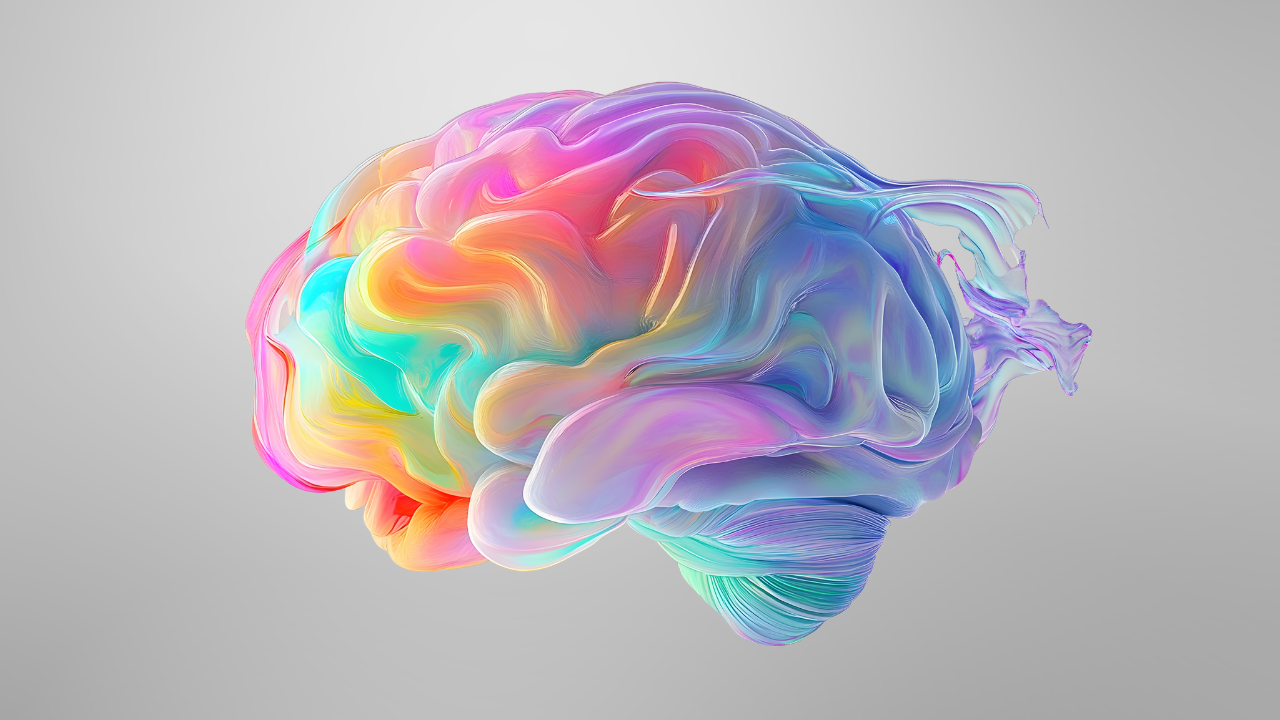
Color is the first thing people notice about a brand.
Color is the first thing people notice about a brand. Before they read a word or understand what you do, they already feel something. That first impression often decides whether they trust you, remember you, or move on.
A strong brand doesn’t use color just to look nice. It uses it to build emotion. The right palette can quietly communicate confidence, warmth, creativity or authority. It’s one of the simplest and most powerful tools to shape how people see you.
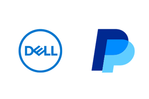
Blue creates a feeling of trust and reliability, which is why so many tech and finance companies choose it: Dell, PayPal. Blue is also associated with intelligence and clarity, making it ideal for brands that want to be seen as dependable and thoughtful.
A strong brand doesn’t use color just to look nice. It uses it to build emotion. The right palette can quietly communicate confidence, warmth, creativity or authority. It’s one of the simplest and most powerful tools to shape how people see you.
Blue creates a feeling of trust and reliability, which is why so many tech and finance companies choose it: Dell, PayPal. Blue is also associated with intelligence and clarity, making it ideal for brands that want to be seen as dependable and thoughtful.
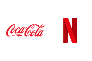
Red grabs attention and evokes energy, passion, and excitement. It’s dynamic, bold, and emotionally intense, often associated with action, urgency, and desire. Coca-Cola and Netflix built entire worlds around it. Brands that want to stand out and inspire strong reactions often use red.
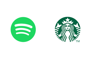
Green speaks of balance and growth, connecting to nature and well-being: from Spotify’s liveliness to Starbucks’ calm. Green can also symbolize wealth, stability, and sustainability, making it versatile for eco-conscious brands or companies in finance and wellness.
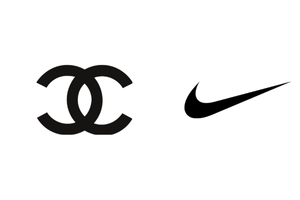
Black carries sophistication, elegance and strength. It conveys authority, luxury, and timelessness, making it perfect for brands that want to appear refined and confident. Think of Chanel, Nike: it can feel powerful and serious, yet minimalist and modern when used thoughtfully.
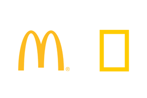
Yellow brings light, optimism and energy. It’s attention-grabbing, cheerful and friendly, evoking warmth and creativity. Brands that want to appear approachable and inspiring often use yellow,like McDonald’s and National Geographic. Softer pastel yellows can feel more gentle, humanand playful, while bright yellows are bold and dynamic.
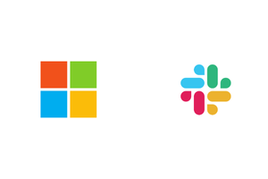
Some brands use multiple colors to convey diversity, creativity and inclusivity. Multicolor logos can express versatility and approachability while standing out in crowded markets. For example, Microsoft’s four-color window communicates innovation and variety, while Slack’s multicolored mark reflects collaboration and creativity.
The most important part is not which color you choose but why. Each tone should reflect what your brand stands for and what your audience wants to feel. If your brand were a person, how would it behave? Calm and thoughtful? Bright and curious? Serious and grounded? Color is how you express that personality before you say anything else.
At Leragraphics, we begin most projects with a study of emotion. Before picking shades, we explore how the brand should make people feel. Only then do we search for colors that express that emotion naturally. We look at contrast, warmth, rhythm and how colors behave together across print and digital spaces. A single tone can shift dramatically depending on what surrounds it or how it’s lit.
There’s also the cultural side. Red can mean danger in one place and celebration in another. Good branding respects those differences. It’s about communicating clearly across cultures without losing your essence.
Consistency makes color even more powerful. When your website, packaging and social media use the same palette, people start recognizing you instantly. Familiarity builds trust. Over time, your colors become part of your signature, something people associate with your voice even before they see your logo.
But sometimes it helps to surprise. A luxury brand can look fresh in dark green. A creative studio might choose unexpected neutrals instead of bright tones. Breaking the pattern can make your brand unforgettable if it fits your story.
Color is both strategy and instinct. It’s science, psychology and art at once. When chosen with purpose, it becomes one of the clearest ways to express who you are.
In the end, great branding makes people feel something real. And color is often the first thing that does it. It’s not just what your audience sees. It’s what they remember.
If you’re exploring the foundations of visual identity, you may also like our previous article “The Power of Minimalism: Why Simple Logos Speak the Loudest”